Crypto Portfolio Dashboard
A tailored dashboard concept focused on financial visibility and interface clarity.
Crypto Portfolio Dashboard
Portfolio Project
Project
Project Focus
Presentation, clarity, and a stronger digital expression for the work, product, or publication behind the site.
What This Shows
How Inoryum approaches real project work with cleaner structure, better hierarchy, and more deliberate execution.
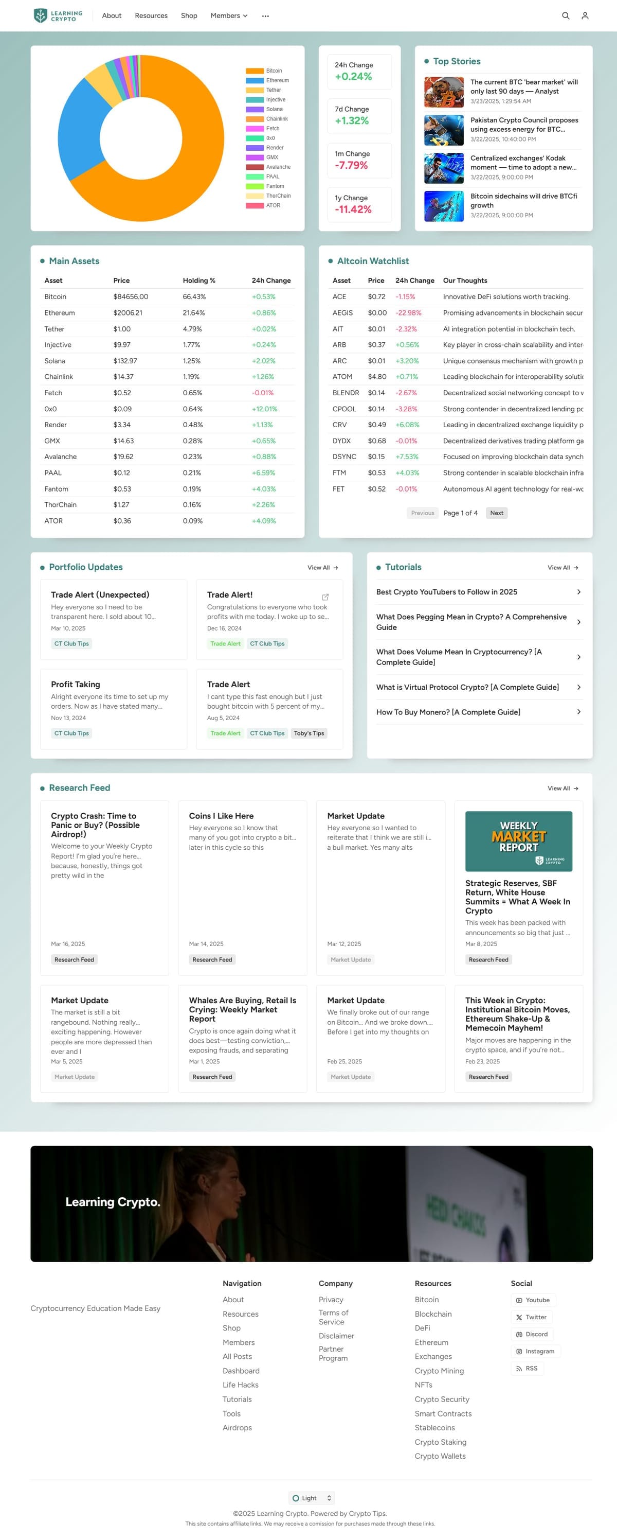
Managing digital assets often means dealing with large amounts of data spread across multiple platforms. This project was created to bring that information together into a clear and organized dashboard.
The focus was on usability, data visibility, and reducing complexity. Portfolio performance, asset allocations, and important metrics were presented in a way that allows users to quickly understand the health of their investments without being overwhelmed by unnecessary information.
The result is a practical financial dashboard that transforms complex data into insights that are easier to monitor and act upon.
Ready to start your project?
Let's collaborate on building a digital presence that feels clearer, stronger, and better aligned with what you are actually trying to say.